3 Tips for Choosing Brand Fonts + Free Font Pairings
Fonts play a big role in your visual branding. It’s important to use fonts that reflect your business and convey the right message. Typography (which includes your fonts) has the power to do this. Working with a professional designer is the best option for ensuring your fonts are high quality and match your brand, but I understand that may not always be an option, especially for a newer business owner.
So how do you choose the best fonts in the meantime? There are so many. Trends come and go and new fonts are being created every single day. So how do you choose fonts that 1) you’re not going to get bored of and 2) that accurately reflect your brand?
Below, I’m going over three tips for choosing fonts that will grow with your brand and not go out of style a year from now.
1. Identify your brand traits first
Before you can choose fonts that represent your brand, you have to identify the traits you’d like to be represented. Brand traits are adjectives that describe how you want your brand to look and feel. For example, the traits for a brand like Everlane might be simple, classic and elegant. Everlane will choose to use fonts in their marketing materials that are aligned with those brand traits. You won’t find trendy or ornate fonts being used because that wouldn’t match with their classic, timeless brand.
2. Stick with 2-3 fonts total
I recommend choosing one font for your headers and a second font for your body copy. If it makes sense for your brand to incorporate a decorative script font, I recommend it be used sparingly, as an accent font. As your brand grows and evolves over time (and trends change) you can easily swap out an accent font without needing to rebrand or make changes to all of your materials.
3. Choose fonts that complement your logo
Rather than using the same font as your logo, try to choose fonts that complement your logo instead. This gives your logo an opportunity to stand apart as its own entity and build brand recognition. This is true especially if your logo is your name written in a font (a wordmark). Choosing a set of brand fonts will help create hierarchy on your website and marketing materials and allow your logo to stand strong on its own.
Here are five (free) Google font pairings that will elevate your brand and make you look like a pro:
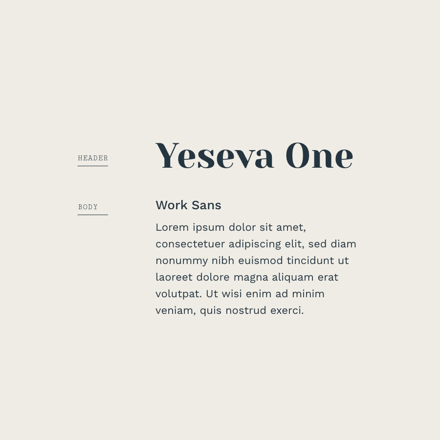
01. Yeseva One & Work Sans
Brand Traits: modern, sophisticated, simple, distinctive
Download these fonts:
05. Source Sans & Source Serif
Brand Traits: Bold, knowledgeable, stable, reliable
Download these fonts:
Looking for even more free font pairings? Check out my Font Pairings & Color Palette Lookbook. This lookbook features free fonts (beyond Google Fonts) so that you can discover the perfect fonts for your brand!


